Typography is subject I have a lot of passion for, it’s the cornerstone of our work on the web, and something that, done right, can enhance effective communication with your audience.
The advent of @font-face has been a great force in the resurgence of web type. It’s brought about a new found interest in typography that has fueled our desire for exciting typefaces and non-standard web fonts.
With the vast library of fonts that @font-face has brought to the web, finally, the print and digital worlds of type have converged - Well, almost.
Getting the basics right
So, you’ve decided to use a custom web font on a new project. You’ll almost certainly be using the @font-face CSS rule to implement said font. What you might not know is that you could have inadvertently introduced some new, font related, problems into your project.
Giving Faux the Middle Finger
Faux styled text is one of my pet peeves. It’s something any discerning web practitioner should learn to identify and avoid and here’s why…
- It looks amateurish.
- It degrades the reading experience.
- It bastardises the type designers original vision.
- People will laugh at you - Obviously.


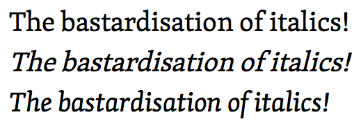
Faux text styling takes a purposefully designed typeface and reduces it to a sickly weak imitation of what it should be.
You may have seen weak bolds with too much letter spacing or drunken italics slanting over to the right and thought to yourself “that doesn’t look right” why is it happening?
Lack of provisions
Probably the most common typographic blunder I see on the web is the failure to include sufficient font coverage. In simple terms, this means the developer/designer hasn’t included bold and italic, or perhaps bold-italic variants of a chosen web font. This is a sure-fire way to faux.
If you going to go down the route of using a custom web font, ensure that you can provide complete font coverage. If you can’t afford the monetary value of the fonts, or perhaps you can’t afford the bandwidth hit, then perhaps you should rethink your decision on using a non-standard web font.
Examples in the wild…
Codepen - Naughty Footer Fail

The reason why it’s happening is because the guys at Codepen (I love and use your product! But just sayin) haven’t included an italic variant of Gotham - Frere-Jones would not be impressed!
@font-face{ font-family: "Gotham SSm A"; font-weight:200; font-style:normal; }
@font-face{ font-family: "Gotham SSm A"; font-weight:400; font-style:normal; }
@font-face{ font-family: "Gotham SSm A"; font-weight:700; font-style:normal; }
@font-face{ font-family: "Gotham SSm A"; font-weight:800; font-style:normal; }

// url() removed for brevity due to huge base64 data uri's
Dropbox - markdown preview fail

@font-face {
  font-family: "Open Sans";
  src: url("fonts/opensans/OpenSans-Regular-webfont.eot");
  src: url("fonts/opensans/OpenSans-Regular-webfont.eot?#iefix") format("embedded-opentype"),
       url("fonts/opensans/OpenSans-Regular-webfont.woff") format("woff"),
       url("fonts/opensans/OpenSans-Regular-webfont.ttf") format("truetype"),
       url("fonts/opensans/OpenSans-Regular-webfont.svg#OpenSansRegular") format("svg");
  font-weight: 400;
  font-style: normal;
}

@font-face {
  font-family: "Open Sans";
  src: url("fonts/opensans/OpenSans-Semibold-webfont.eot");
  src: url("fonts/opensans/OpenSans-Semibold-webfont.eot?#iefix") format("embedded-opentype"),
       url("fonts/opensans/OpenSans-Semibold-webfont.woff") format("woff"),
       url("fonts/opensans/OpenSans-Semibold-webfont.ttf") format("truetype"),
       url("fonts/opensans/OpenSans-Semibold-webfont.svg#OpenSansSemibold") format("svg");
  font-weight: 600;
  font-style: normal;
}
Another case of incomplete font coverage, no italic variants being referenced!
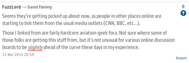
The Guardian - comments section fail


The guardian are using some crazy json/base64 font loading method to inject fonts on to a page, but suffice to say, they went faux too.
Is it that bad? Some of you might look at this and think it’s not much of a big deal, but that depends on your point of view. Are you content with mediocracy? Or are you striving for perfection?
Browser Inconsistencies.
For all its shortcomings, IE can actually handle @font-face pretty well - which is great. Unfortunately or predictably there are slight inconsistencies with the way it goes about it.
If for instance you use the Google web font service to deliver “Open-Sans” regular, bold and italic to an IE8 or below browser, you’ll be overcome with shock and dismay when you realise that your bold and italic fonts are displaying in that nasty faux styling.
The reason for this can be gleamed from the style sheet that Google provides…
@font-face {
  font-family: 'Open Sans';
  font-style: normal;
  font-weight: 400;
  src: url(http://themes.googleusercontent.com/static/fonts/opensans/v8/cJZKeOuBrn4kERxqtaUH3fY6323mHUZFJMgTvxaG2iE.eot);
  src: local('Open Sans'), local('OpenSans'), url(http://themes.googleusercontent.com/static/fonts/opensans/v8/cJZKeOuBrn4kERxqtaUH3fY6323mHUZFJMgTvxaG2iE.eot) format('embedded-opentype'), url(http://themes.googleusercontent.com/static/fonts/opensans/v8/cJZKeOuBrn4kERxqtaUH3T8E0i7KZn-EPnyo3HZu7kw.woff) format('woff');
}
Dude, where’s my other fonts? As you can see, only one @font-face rule is provided. The Google has detected that your browser is partially incapable of supporting same name font-face rules. Which is the usual method that Google uses to deliver fonts.
An example of which can be seen here…
@font-face {
  font-family: 'Open Sans';
  font-style: normal;
  font-weight: 400;
  src: local('Open Sans'), local('OpenSans'), url(http://themes.googleusercontent.com/static/fonts/opensans/v8/cJZKeOuBrn4kERxqtaUH3bO3LdcAZYWl9Si6vvxL-qU.woff) format('woff');
}
@font-face {
  font-family: 'Open Sans';
  font-style: normal;
  font-weight: 700;
  src: local('Open Sans Bold'), local('OpenSans-Bold'), url(http://themes.googleusercontent.com/static/fonts/opensans/v8/k3k702ZOKiLJc3WVjuplzKRDOzjiPcYnFooOUGCOsRk.woff) format('woff');
}
@font-face {
  font-family: 'Open Sans';
  font-style: italic;
  font-weight: 400;
  src: local('Open Sans Italic'), local('OpenSans-Italic'), url(http://themes.googleusercontent.com/static/fonts/opensans/v8/xjAJXh38I15wypJXxuGMBrrIa-7acMAeDBVuclsi6Gc.woff) format('woff');
}
@font-face {
  font-family: 'Open Sans';
  font-style: italic;
  font-weight: 700;
  src: local('Open Sans Bold Italic'), local('OpenSans-BoldItalic'), url(http://themes.googleusercontent.com/static/fonts/opensans/v8/PRmiXeptR36kaC0GEAetxhbnBKKEOwRKgsHDreGcocg.woff) format('woff');
}
The Problem is that each typeface in the font has the same font-family property, IE8 doesn’t like this and will subsequently ignore all proceeding @font-face declarations.
To avoid this from happening you could name the font-family property differently for each typeface giving you something more like this…
@font-face {
  font-family: 'Open Sans';
  font-style: normal;
  font-weight: 400;
  src: local('Open Sans'), local('OpenSans'), url(http://themes.googleusercontent.com/static/fonts/opensans/v8/cJZKeOuBrn4kERxqtaUH3bO3LdcAZYWl9Si6vvxL-qU.woff) format('woff');
}
@font-face {
  font-family: 'Open Sans Bold';
  font-style: normal;
  font-weight: 700;
  src: local('Open Sans Bold'), local('OpenSans-Bold'), url(http://themes.googleusercontent.com/static/fonts/opensans/v8/k3k702ZOKiLJc3WVjuplzKRDOzjiPcYnFooOUGCOsRk.woff) format('woff');
}
@font-face {
  font-family: 'Open Sans Italic';
  font-style: italic;
  font-weight: 400;
  src: local('Open Sans Italic'), local('OpenSans-Italic'), url(http://themes.googleusercontent.com/static/fonts/opensans/v8/xjAJXh38I15wypJXxuGMBrrIa-7acMAeDBVuclsi6Gc.woff) format('woff');
}
@font-face {
  font-family: 'Open Sans Bold Italic';
  font-style: italic;
  font-weight: 700;
  src: local('Open Sans Bold Italic'), local('OpenSans-BoldItalic'), url(http://themes.googleusercontent.com/static/fonts/opensans/v8/PRmiXeptR36kaC0GEAetxhbnBKKEOwRKgsHDreGcocg.woff) format('woff');
}
The Google web font service doesn’t deliver like this though. However the great thing about all the Google fonts is that they’re all open source, so you’re welcome to download the font from another location and configure your own style sheet.
Having said that, if you use a font delivery service like Fontdeck or Typekit, you might not have a choice in which method you use, so do your research and check that the service meets your expectations.
The syntax Google and some of the other font providers use is perfectly legitimate and works in all modern browsers, IE9+ included. In fact I’d recommend using this method as it tends to make for more logical CSS. The alternate font-family name method relies on using the font-family CSS property to configure weight and style which in my eyes is counter intuitive.
If you use the same name font-family rule and you’re worried about IE8 and below, you’ll have to apply an IE fall back, of which there a couple of different methods. In the past, I've used IE conditional comments to supply an alternate named font-family.
body {
  font-family: 'Open Sans';
}
strong, b {
  font-weight: bold;

  .lt-ie9 & {
    font-family: 'Open Sans Bold';
    font-weight: normal;
  }
}
Typography Test Bed
Now that you have a solid technical solution in place, Test it! One of the best ways I’ve found to test your type is to create a style guide. By producing a simple linear set of HTML elements, you can check all the scenarios in which your type will be used. Be thorough, try combinations that are unlikely to occur, nest your <em> and <strong> tags. Add weight and italics to your display headings, try to break it! I’ve found Browserstack to be an indispensable tool for this type of on-the-fly testing.
You’ll be able to add to this style guide as your project progresses too, and the great thing about them is that they’re very easy to transfer to a different project. You’ll soon find that your typography is perfect in every project, in every browser, Go You!
Overindulgence
With all these exciting new fonts at our finger tips, it’s always tempting to go overboard, just remember to keep your font count at a reasonable level, each additional font adds to that all important page weight.
Conclusion
If you follow these guidelines, you’ll have a pretty decent typographic system in place that looks great in all browsers. More importantly, you’ll be on a level playing field with Arial, Verdana and Georgia!
In part two of this series, I’ll be revealing some more typographical recommendations that can add a touch of finesse to your project; really making your content sing.
